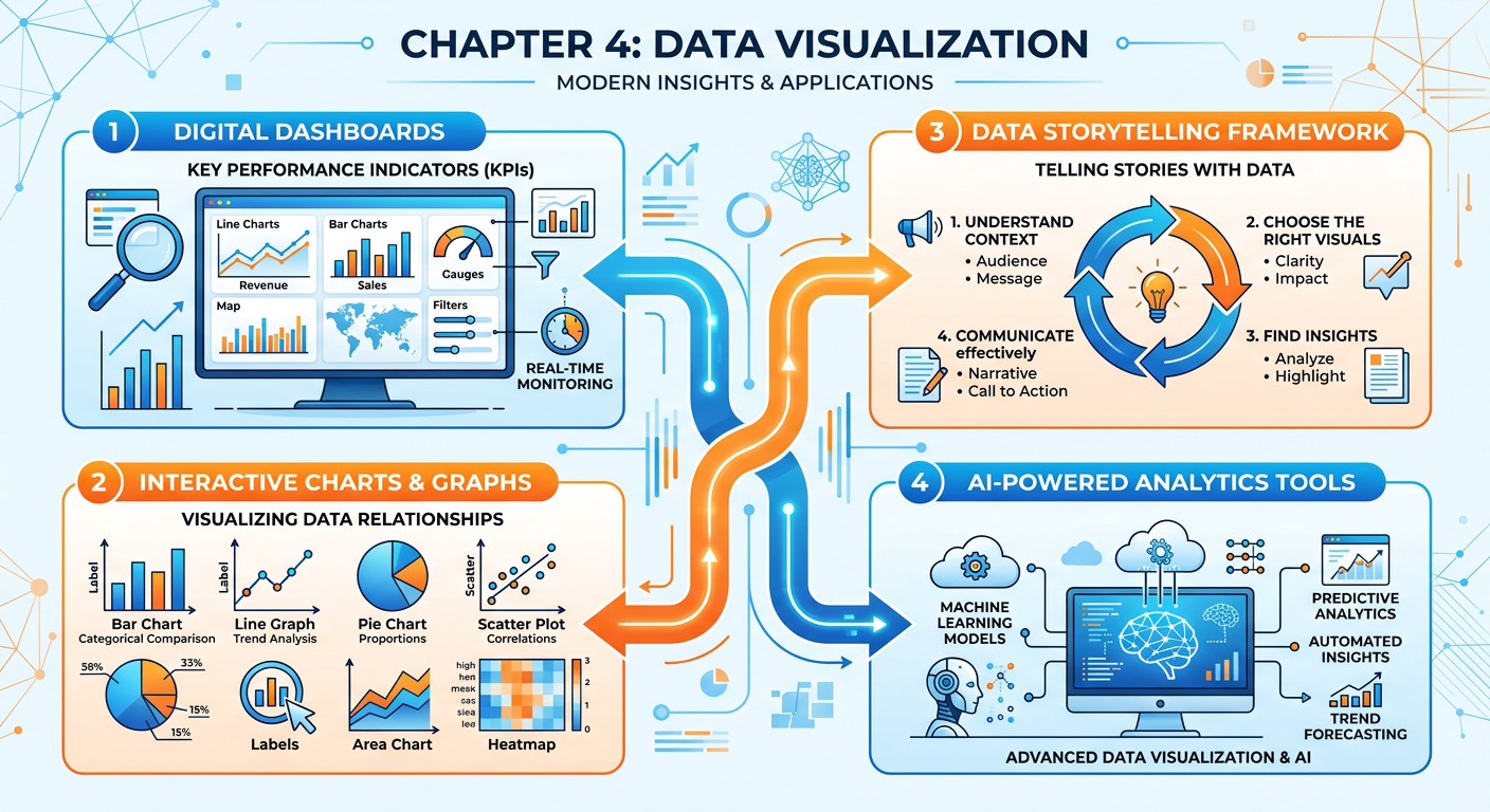
Figure 1:Explainer Infographic: Chapter 4: Data Visualization.
1Introduction: Why Visualization Is the Language of Modern Business
In the age of big data, the ability to collect, store, and process information has outpaced the human brain’s ability to naturally make sense of it. Organizations generate terabytes of transactional records, sensor readings, social media signals, and behavioral logs every single day. Yet none of this data matters until someone — a manager, an analyst, an executive, or a customer — can understand what it means. This is where data visualization steps in, not as a cosmetic layer on top of analysis, but as the very mechanism through which insight becomes action.
Data visualization is the graphical representation of information and data. By using visual elements like charts, graphs, maps, and dashboards, visualization tools provide an accessible way to see and understand trends, outliers, and patterns in data. For graduate business students preparing to lead data-informed organizations, mastering the principles and practice of visualization is not optional — it is a core professional competency.
This chapter approaches visualization from three interconnected angles. First, we examine the science and art of charting: how to select the right visual for the right data and the right audience. Second, we explore dashboard design: how organizations build living, interactive views of their business performance. Third, we tackle data storytelling: how to craft a narrative with data that persuades, informs, and drives decisions. Throughout, we connect these concepts to the tools and AI-powered platforms reshaping the field — including Manus, an AI agent platform that enables you to conduct real analytics tasks through natural language. The chapter closes with two major applied activities: a hands-on Manus project and the course’s Midterm Activity, in which you will build the analytics foundation for a real business.
24.1 The Science and Psychology of Visual Perception
Before we learn how to make charts, we must understand how the human brain processes visual information. This is not merely academic — it is the foundation on which all good visualization rests.
2.14.1.1 Pre-Attentive Attributes
Cognitive scientists have identified a set of visual properties that the human brain processes almost instantaneously, before conscious attention is engaged. These are called pre-attentive attributes, and they include color hue, color intensity, size, shape, position, orientation, and motion. When you see a red dot among twenty blue dots, you do not have to search for it. Your visual system identifies it in under 250 milliseconds.
Skilled data visualizers exploit pre-attentive attributes deliberately. If you want a viewer’s eye to jump to the most critical data point in a chart, you make it a different color. If you want to show magnitude, you vary size. If you want to show change over time, you use position along a horizontal axis — the most precise and accurate visual encoding channel available to human perception.
2.24.1.2 The Data-Ink Ratio
Edward Tufte, the legendary statistician and visualization pioneer, introduced the concept of the data-ink ratio in his 1983 work The Visual Display of Quantitative Information. The ratio is simple: the proportion of a visualization’s ink that is actually used to represent data, divided by the total ink used. Tufte’s argument was that non-data ink — gridlines, background fills, unnecessary borders, decorative shadows, and 3D effects — competes with the actual information and should be eliminated or minimized.
This principle has enormous practical implications. Charts with heavy borders, gradient backgrounds, unnecessary legends, and decorative icons may look impressive at first glance, but they slow comprehension and introduce perceptual distraction. The goal of visualization is not aesthetic spectacle — it is clarity of insight.
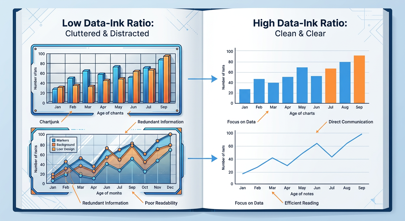
Figure 2:Comparison of high vs. low data-ink ratio chart designs. The right-side versions communicate the same data with greater clarity and cognitive efficiency.
2.34.1.3 Cognitive Load and Working Memory
The human working memory can hold approximately four chunks of information at once (Cowan, 2001). Visualizations that present too many variables, use inconsistent color schemes, or require significant mental translation impose high cognitive load on the viewer, reducing comprehension and recall. This is why information design is ultimately an act of empathy — the best chart is one designed not for what the creator knows, but for what the audience needs to process.
In business settings, audiences are often time-constrained executives, distracted managers, or customers with no statistical training. Designing for cognitive efficiency is not dumbing down — it is precision communication.
34.2 Chart Selection: Matching Visual Form to Analytical Purpose
One of the most common mistakes made by analysts at every level — from interns to senior data scientists — is selecting a chart type based on aesthetic preference rather than analytical purpose. A chart is a tool, and like any tool, the wrong one makes the job harder. The following sections provide a systematic framework for chart selection.
3.14.2.1 A Taxonomy of Chart Types
Charts can be classified by the type of relationship or comparison they are designed to convey. The four primary analytical relationships are: comparison, distribution, composition, and relationship.
Comparison charts are used when the goal is to show how one or more data series differ across categories or time. Bar charts (both horizontal and vertical) are the workhorse of comparison visualization. Line charts excel when comparing continuous change over time. Bullet charts are effective for comparing performance against a target.
Distribution charts reveal how values are spread across a dataset. Histograms show the frequency distribution of a single variable. Box plots (also called box-and-whisker plots) summarize distribution using five statistics: minimum, first quartile, median, third quartile, and maximum. Violin plots add density curves to the box plot framework, providing richer shape information.
Composition charts show how a whole is divided into parts, either at a single point in time or across multiple time periods. Pie charts are the most familiar, though their usefulness is limited to cases with very few categories. Stacked bar charts show part-to-whole relationships across multiple categories. Treemaps use nested rectangles to represent hierarchical composition, making them excellent for large datasets.
Relationship charts reveal correlations, clusters, or patterns between two or more variables. Scatter plots are the most powerful and underused relationship charts in business analytics. Bubble charts extend the scatter plot by encoding a third variable as circle size. Heatmaps use color intensity to reveal correlation patterns across a matrix of variables.
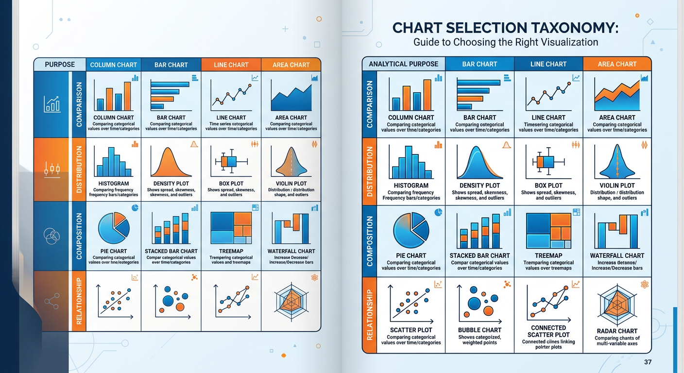
Figure 3:Chart Selection Taxonomy: Matching chart type to analytical purpose. Use this framework as a decision guide when choosing how to visualize your data.
3.24.2.2 The Pie Chart Debate
Few topics in data visualization generate more heated debate than the pie chart. Critics — including Tufte, Stephen Few, and most academic visualization researchers — argue that pie charts are among the worst charts ever invented. The fundamental problem is that humans are far better at comparing lengths (as in bar charts) than at comparing angles and areas (as in pie charts). When two slices of a pie are close in size, it is genuinely difficult to determine which is larger without data labels — which defeats the purpose of a visual encoding.
Defenders of the pie chart argue that it is effective for showing that one category clearly dominates (e.g., 80% vs. 20%), for audiences unfamiliar with bar charts, and in contexts where part-to-whole narrative is more important than precise comparison.
3.34.2.3 Choosing the Right Chart: A Decision Framework
The following decision framework synthesizes research from Few (2012), Cairo (2016), and Knaflic (2015) into a practical tool for business analysts.
Begin by articulating precisely what question the visualization should answer. Is it “How did sales change over the last 12 months?” Or “Which product categories contributed most to revenue?” Or “Is there a correlation between marketing spend and customer acquisition?” The question determines the chart type, not the other way around.
Determine whether your variables are categorical (nominal or ordinal) or quantitative (discrete or continuous). This constrains your options significantly. Continuous variables over time → line chart. Categorical comparison → bar chart. Two continuous variables → scatter plot.
**A ** financial analyst can read a scatter plot with regression lines. A store manager may need a simple bar chart with a single highlighted bar. A C-suite executive needs a single number with a trend arrow. Know your audience before you finalize your design.
Build a draft of your visualization and show it to one or two people who represent your target audience. Ask them to tell you what they see. If they describe something different from what you intended, redesign before distributing.
44.3 Dashboard Design: Building the Nerve Center of the Business
**A ** dashboard is a visual display of the most important information needed to achieve one or more objectives, consolidated and arranged on a single screen so the information can be monitored at a glance. This definition, from Stephen Few’s foundational work Information Dashboard Design (2006), contains a crucial constraint often ignored by dashboard builders: a single screen.
The most common dashboard design failure is scope creep — the tendency to add more and more metrics until the dashboard becomes a scrolling report rather than a monitoring tool. A true dashboard should be readable in under five seconds. It is the organizational equivalent of a cockpit: the pilot does not need to know everything about the plane at every moment, only the critical indicators that signal whether the flight is on course.
4.14.3.1 Types of Dashboards
Not all dashboards serve the same purpose, and understanding the distinction is essential for designing them correctly.
Strategic dashboards (also called executive dashboards) monitor the progress of the organization toward high-level strategic goals. They typically show KPIs (Key Performance Indicators) on a monthly or quarterly basis and are consumed by senior leadership. Examples include total revenue vs. target, market share trend, customer satisfaction score (NPS), and employee retention rate.
Operational dashboards monitor the performance of ongoing business processes in real time or near-real time. They are used by frontline managers and operational staff. Examples include call center dashboards (calls in queue, average handle time, first call resolution rate) and e-commerce dashboards (active sessions, cart abandonment rate, orders per hour).
Analytical dashboards support exploratory analysis and deep dives. They are designed for data analysts and business analysts who need to slice, filter, and drill down into data to answer specific questions. Analytical dashboards sacrifice the “glance-ability” of strategic dashboards for the interactivity and depth needed for investigation.
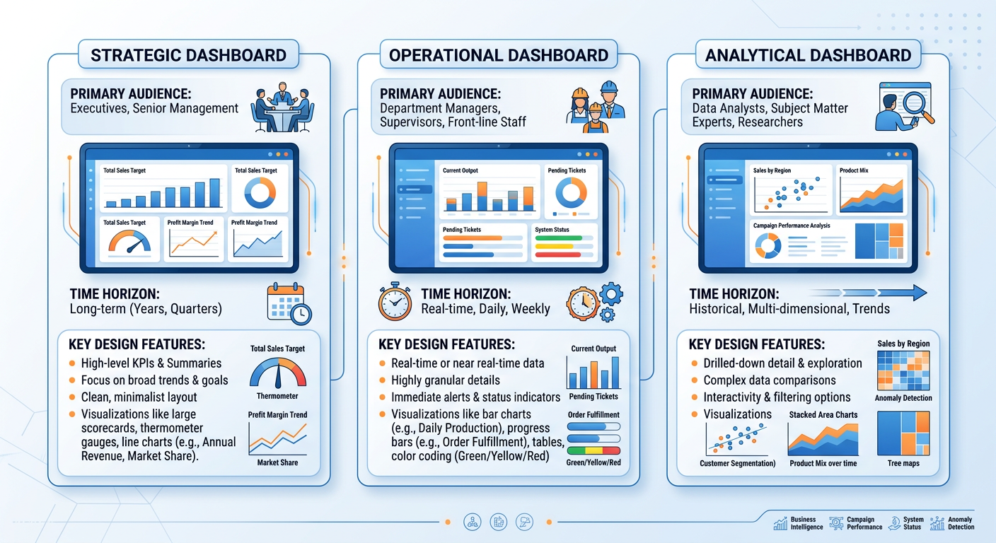
Figure 4:The Three Types of Business Dashboards: Strategic, Operational, and Analytical — each designed for a different audience, time horizon, and decision context.
4.24.3.2 The Anatomy of an Effective Dashboard
Effective dashboard design follows a hierarchy of layout and visual weight. The most important metrics should occupy the top-left of the screen (where Western readers’ eyes naturally land first) and should be displayed in the largest, most prominent visual elements. Supporting context and detail should follow in a logical reading order.
**A ** well-designed dashboard typically includes the following elements:
KPI tiles or scorecards display a single metric with its current value, comparison period value, and a directional indicator (up/down arrow or color code). These are the fastest-reading elements on the dashboard and should occupy the most prominent position.
Trend lines accompany KPI tiles to show recent trajectory. A revenue figure of $4.2M means nothing in isolation; combined with a downward-sloping line showing three consecutive months of decline, it is actionable.
Comparative visualizations (bar charts, bullet charts) provide context by showing how current performance compares to targets, prior periods, or benchmarks.
Filters and drill-down controls allow users to customize their view by time period, geography, product line, or other dimensions. These are essential in analytical dashboards but should be used judiciously in executive dashboards.
4.34.3.3 Color in Dashboards
Color is one of the most powerful — and most misused — elements in dashboard design. In operational and strategic dashboards, color should primarily serve a signaling function: green means good, red means bad, yellow means caution. This traffic light convention is deeply embedded in business culture and should not be subverted without good reason.
However, designers must be aware of color blindness, which affects approximately 8% of men and 0.5% of women of Northern European descent. The most common form is red-green color blindness (deuteranopia), which makes the ubiquitous red/green traffic light coding completely inaccessible to a significant portion of your audience. Best practice is to supplement color with a secondary encoding (shape, position, or text label) so that the information is never conveyed by color alone.
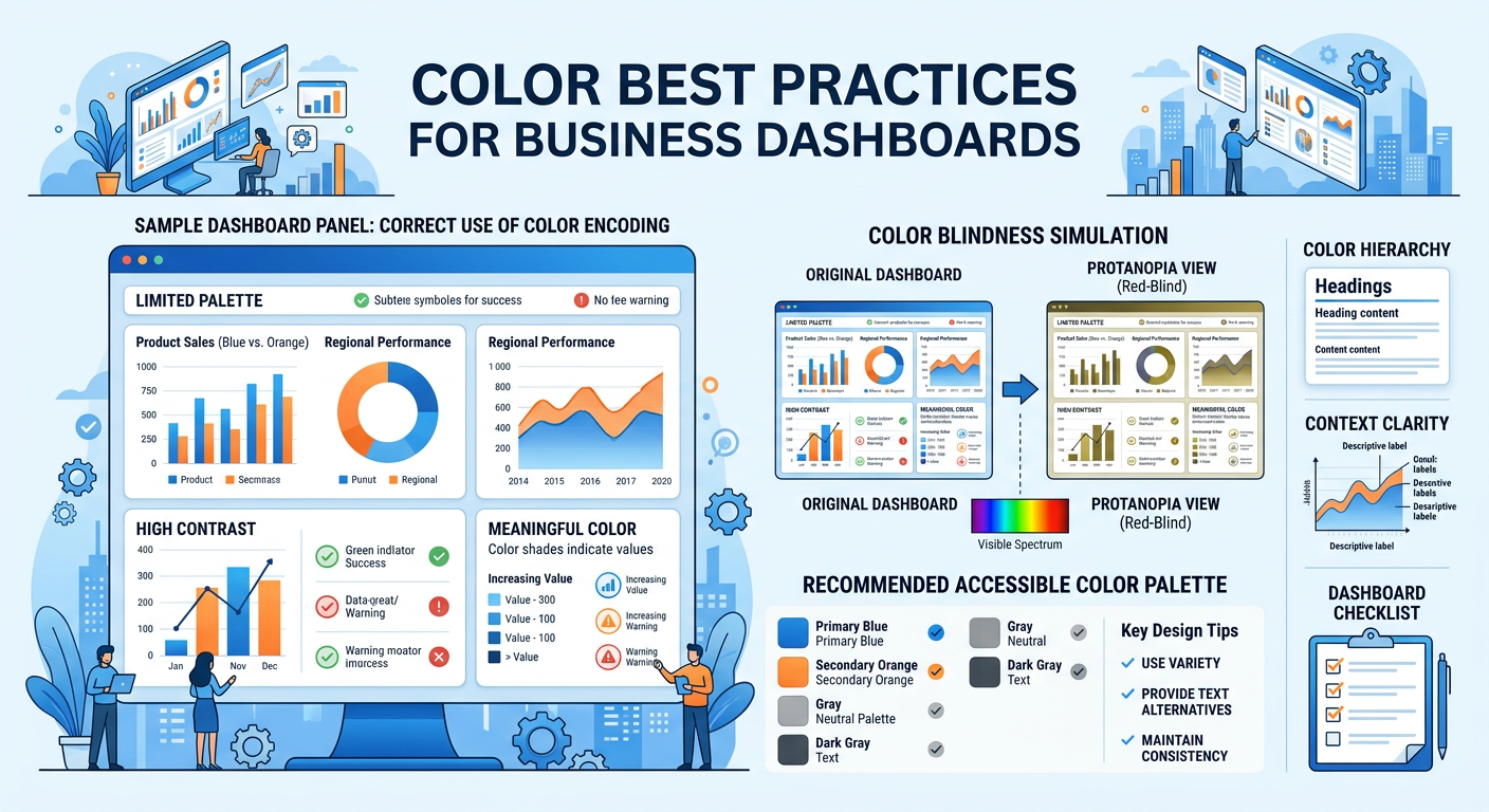
Figure 5:Dashboard Color Best Practices: Effective use of color as a signaling mechanism, with attention to accessibility and color blindness considerations.
4.44.3.4 Dashboard Tools in the AI Era
The landscape of business intelligence and dashboard tools has never been richer. The leading platforms — Tableau, Microsoft Power BI, Google Looker Studio, Qlik Sense, and Salesforce Einstein Analytics — all offer drag-and-drop interfaces, cloud connectivity, and increasingly powerful AI-assisted features.
Microsoft Power BI’s “Copilot” feature, for example, allows users to generate entire report pages by typing natural language descriptions like “Show me monthly sales by region with a trend line and highlight months that missed target.” Tableau has introduced similar AI features through its “Pulse” and “Einstein” integrations. These developments represent a fundamental democratization of dashboard creation — moving the skill requirement from technical configuration to analytical and communication clarity.
For students entering analytics-intensive roles, this shift means that your competitive advantage lies not in knowing which buttons to click in a BI tool, but in understanding what to measure, how to structure the analysis, and how to communicate findings effectively to decision-makers. The machine can build the chart; only you can determine whether it answers the right question.
54.4 Data Storytelling: From Information to Insight to Action
Data storytelling is the practice of building a compelling, structured narrative around data insights to influence beliefs and drive decisions. It is the highest form of data communication — and the most undervalued skill in many analytics teams.
The distinction between data reporting and data storytelling is not merely stylistic. A data report presents information; a data story creates understanding, emotional engagement, and motivation to act. In an organizational context, decisions are not made purely by logic — they are made by people with goals, fears, biases, and competing priorities. A data story meets decision-makers where they are, connecting analytical findings to the issues they care about most.
5.14.4.1 The Three Pillars of Data Storytelling
Brent Dykes, in his book Effective Data Storytelling (2019), identifies three essential components of a data story: data, narrative, and visuals. These three elements work in combination, and the absence of any one of them diminishes the whole.
Data is the analytical foundation. Without rigorous, accurate, and relevant data, the story has no credibility. Data quality is not just a technical concern — it is a storytelling concern. An audience that discovers a data error in your presentation will distrust everything else you show them.
Narrative is the explanatory thread that connects data points into a coherent argument. It answers the questions: So what? Why does this matter? What should we do? A narrative gives data context, causality, and consequence. It is the voice of the analyst speaking through the visualization.
Visuals are the encoding mechanism that makes the data and narrative immediately comprehensible. A well-chosen visual can communicate in one second what a table of numbers requires minutes to parse. Visuals also have emotional resonance — a map of disease spread, a scatter plot showing income inequality, a line chart of declining customer retention — these images create impact that numbers alone cannot.
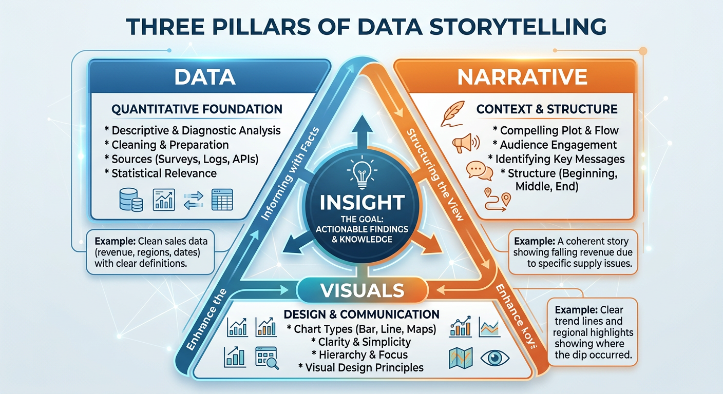
Figure 6:The Three Pillars of Data Storytelling: Data, Narrative, and Visuals combine to create insight that drives organizational action.
5.24.4.2 Narrative Structures for Business Data Stories
Experienced data storytellers often rely on established narrative frameworks to structure their presentations. Several structures are particularly well-suited to business analytics contexts.
The Situation-Complication-Resolution (SCR) Framework, developed by Barbara Minto of McKinsey & Company, structures a data story in three acts. The situation establishes what is currently true and accepted as fact by the audience. The complication introduces a problem, gap, or change that disrupts the status quo. The resolution presents the analytical findings and recommended response. This structure is efficient, familiar to business audiences, and particularly effective when the goal is to propose a decision or course of action.
The What-So What-Now What Framework is a simplified version of SCR often used in operational reporting contexts. “What” presents the data. “So What” explains its significance. “Now What” proposes action. This structure is easy to remember and can be applied to verbal presentations, written reports, and slide decks alike.
The Martini Glass Structure begins with a broad, contextual opening that frames the topic for the audience, then narrows progressively to a specific, focused conclusion. Like the shape of the glass, the story starts wide and ends at a precise point. This structure is particularly effective in executive presentations where context-setting is important before delivering a specific recommendation.
5.34.4.3 Designing for the Decision
Perhaps the most important principle in data storytelling is designing for the decision, not the data. Many analysts approach presentations by organizing their content chronologically (first we collected the data, then we cleaned it, then we analyzed it…) or categorically (here are all the revenue metrics, now here are all the customer metrics…). Both approaches put the burden on the audience to synthesize the findings into a decision.
The better approach is to start with the decision the audience needs to make, and then present only the data that directly informs that decision. Ask yourself: what is the one thing I want the audience to do or believe after seeing this? Every chart, every data point, every narrative sentence should be evaluated against its contribution to that single outcome.
5.44.4.4 Ethical Dimensions of Data Visualization
The power of data visualization to persuade carries with it a significant ethical responsibility. Visual representations of data can mislead through design choices that are technically accurate but perceptually deceptive. Common patterns of misleading visualization include:
Truncated Y-axes make small differences appear large by starting the vertical axis at a value above zero. This technique is frequently used in media, politics, and corporate communications to exaggerate trends. The ethical standard for most comparison charts is to start the Y-axis at zero.
Selective time windows show only the portion of a trend that supports a particular argument, hiding reversals, context, or long-term patterns that would complicate the narrative.
Cherry-picked comparisons select benchmarks or comparison groups that are designed to make performance look better or worse than it truly is.
Misleading scales and proportions in maps and geographic visualizations can overrepresent certain regions due to their physical size, creating the false impression that populous but geographically compact regions are insignificant.
As business analysts and future leaders, your credibility rests on the trust that stakeholders place in your analysis. A single instance of perceived manipulation — even if unintentional — can permanently damage your reputation and the credibility of your entire analytics function.
64.5 AI-Powered Visualization in the Modern Enterprise
The integration of artificial intelligence into the visualization and analytics stack has accelerated dramatically since 2022. Today’s leading platforms offer capabilities that were science fiction a decade ago, and understanding how to leverage these tools is a critical professional skill.
6.14.5.1 Natural Language Generation (NLG) for Data Narratives
Natural Language Generation is a branch of AI that automatically produces human-readable text from structured data. In visualization tools, NLG appears as auto-generated summaries, insight callouts, and narrative captions that describe what a chart shows in plain English. Tableau’s “Explain Data,” Power BI’s “Smart Narratives,” and Qlik’s “Insight Advisor” all use NLG to reduce the time between data and insight.
The business implication is significant: organizations can now produce first-draft data narratives at scale, across thousands of reports, without requiring a human analyst to write each one. The analyst’s role shifts toward curation — evaluating the AI-generated narrative for accuracy, relevance, and business alignment, and adding the strategic context that only a human can provide.
6.24.5.2 Automated Insight Detection
Beyond narrative generation, AI systems can now surface insights proactively — detecting anomalies, correlations, trends, and outliers in data without being asked. These systems use techniques from statistics and machine learning including time series decomposition, clustering, and causal inference to identify patterns that merit human attention.
For dashboard designers, this means that the dashboard of the future may be less a static set of pre-built charts and more a dynamic feed of AI-surfaced insights, ranked by business relevance and delivered at the moment of decision. The analyst’s role in this paradigm is to define the business context, KPIs, and decision frameworks within which the AI operates — not to manually hunt for every insight.
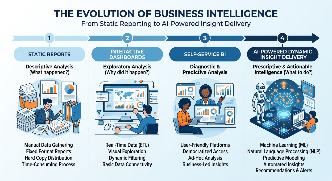
Figure 7:The Evolution of Business Intelligence: From static reports to AI-powered dynamic insight delivery, each stage representing a shift in the analyst’s role and the speed of decision-making.
6.34.5.3 Manus: AI-Powered Analytics and Visualization
Manus is an AI agent platform that represents the cutting edge of AI-assisted analytics. Unlike traditional BI tools that require a user to navigate menus, write code, or configure visual elements manually, Manus enables users to describe analytical tasks in natural language and receive fully executed outputs — including data cleaning, analysis, chart generation, and written interpretation.
For students and practitioners, Manus democratizes access to sophisticated analytics workflows. A user can say: “I have a dataset of customer transactions for a retail chain. Show me which product categories are driving the most revenue growth this quarter, which customer segments are most valuable, and what the top three recommendations are for the marketing team.” Manus will execute this request end-to-end, leveraging its analytical capabilities to produce charts, tables, and a structured narrative.
Understanding how to work effectively with Manus — providing clear context, refining outputs, evaluating quality, and integrating results into decision-making — is itself a professional competency. This chapter’s hands-on activity and midterm project give you structured practice in exactly this domain.
74.6 Visualization in Practice: Industry Applications
Data visualization is not a generic skill — it takes on different forms, priorities, and conventions across industries. Understanding the domain-specific context of visualization is important for applying these principles effectively in your career.
7.14.6.1 Financial Services
In financial services, visualization serves risk management, portfolio analysis, regulatory compliance, and customer reporting. Common chart types include candlestick charts (stock price movement), waterfall charts (financial reconciliation and cash flow analysis), and heat maps (risk exposure matrices). The critical design challenge in financial visualization is balancing complexity (financial data is inherently multi-dimensional) with clarity (regulators and clients need to understand the display). Bloomberg Terminal, Refinitiv Eikon, and Tableau are the dominant tools in this space.
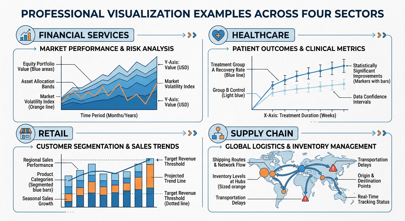
Figure 8:Industry-Specific Visualization: Common chart types and design conventions across Financial Services, Healthcare, Retail, and Supply Chain sectors.
7.24.6.2 Healthcare and Public Health
Healthcare visualization must balance clinical precision with accessibility to non-specialist audiences. Epidemiological maps (choropleth maps showing disease prevalence by region), survival curves (Kaplan-Meier plots), and clinical trial outcome visualizations all require specialized design conventions. The COVID-19 pandemic brought public health visualization to mainstream attention, as organizations like Johns Hopkins and the CDC produced dashboards that were viewed by millions of non-specialists daily. The design challenge of communicating statistical uncertainty (confidence intervals, case count variability) to a general audience became a matter of public health urgency.
7.34.6.3 Retail and E-Commerce
Retail analytics visualization focuses on sales performance, inventory management, customer behavior, and promotional effectiveness. Funnel charts visualize the customer journey from awareness to purchase. Heatmaps of website clickstream data show where users focus their attention on a page. Cohort analysis charts track the retention and purchasing behavior of customer groups over time. Geographic maps of store performance and market penetration are central to retail strategy visualization.
7.44.6.4 Supply Chain and Operations
Operations and supply chain visualization prioritizes process monitoring and exception detection. Gantt charts visualize project and production schedules. Sankey diagrams show the flow of materials, costs, or energy through a system. Control charts (from the field of statistical process control) monitor whether a process is operating within acceptable limits over time. The operational context demands dashboards that are monitored continuously and designed to surface exceptions instantly.
84.7 Building Your Visualization Portfolio
For graduate business students, a visualization portfolio is a tangible, differentiated asset in your job search. Hiring managers in analytics, consulting, strategy, and operations roles increasingly expect candidates to demonstrate not just knowledge of visualization principles, but evidence of having applied them to real problems.
**A ** strong visualization portfolio should include examples across multiple chart types, at least one interactive dashboard (built in Tableau Public, Power BI, or a similar platform), and at least one data story that presents a complete analytical narrative from question to recommendation. The analyses you complete in this course — particularly the Manus hands-on activity and the Midterm Activity — are ideal starting points for your portfolio.
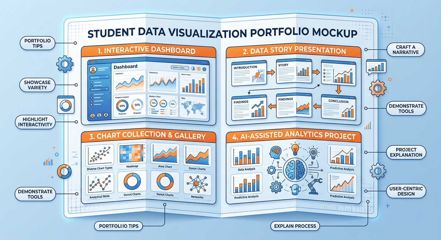
Figure 9:Building a Visualization Portfolio: Key components and examples of a professional data visualization portfolio for graduate business students.
94.8 Discussion Question: The Spotify Wrapped Case Study
Discussion Question:
Spotify Wrapped uses personal behavioral data to create an emotional storytelling experience that drives measurable business outcomes (retention, brand awareness, social sharing). Drawing on the principles of data storytelling, dashboard design, and ethical visualization discussed in this chapter, critically analyze the following: (1) What specific visualization and storytelling design choices make Spotify Wrapped effective, and why do these choices work given what we know about human visual perception and cognition? (2) How could a retail company, a healthcare organization, or a financial services firm adapt the Wrapped model to create a similarly compelling personalized data story for their customers? (3) Are there ethical risks in this model — specifically around data privacy, manipulation, and the gamification of personal data consumption — and how should organizations balance personalization with responsibility?
Your response should be approximately 400–600 words and should reference at least two frameworks or concepts from this chapter.
9.1📝 Discussion Guidelines
Primary Response: Your initial post must address all parts of the prompt with depth and critical thinking. It must include at least one citation (scholarly or credible industry source) to support your argument.
Peer Responses: You must respond thoughtfully to at least two of your peers. Your responses must go beyond simple agreement (e.g., “I agree with your point”) and add substantial value to the conversation by offering an alternative perspective, sharing related research, or asking a challenging follow-up question.
104.9 Chapter Quiz
Instructions: Answer all 10 questions. Questions are a mix of multiple choice, true/false, and short answer. This quiz covers all sections of Chapter 4.
According to cognitive science research on pre-attentive attributes, which visual encoding channel is the most accurate for communicating quantitative data?
Edward Tufte’s “data-ink ratio” concept argues that effective visualizations should: (a) maximize total ink used for visual impact, (b) maximize the proportion of ink that represents actual data, (c) use color as the primary encoding for all quantitative variables, or (d) always start the Y-axis at zero.
True or False: A 3D pie chart is a valid and effective way to show part-to-whole relationships when there are more than five categories, because the third dimension makes it easier to distinguish between similar-sized segments.
What is the key difference between a strategic dashboard and an operational dashboard? Provide a specific example of each from a retail company context.
A scatter plot is most appropriate for visualizing which type of analytical relationship: (a) composition, (b) distribution over time, (c) relationship between two continuous variables, or (d) categorical comparison?
According to the Situation-Complication-Resolution (SCR) framework, in which part of a data story presentation would you typically present your analytical findings and recommendations?
Identify and explain two techniques that can make a data visualization misleading without technically falsifying the underlying data.
True or False: In dashboard design for diverse audiences, using red to indicate poor performance and green to indicate good performance is always sufficient because these colors are universally understood.
Natural Language Generation (NLG) in visualization tools like Power BI and Tableau primarily serves what function for business analysts?
You are building a dashboard for the Vice President of Operations at a logistics company. She needs to monitor on-time delivery rates, warehouse capacity utilization, and order processing errors across five distribution centers in real time. Based on the principles in this chapter, what type of dashboard should you build, what three chart types would you prioritize, and what is the single most important design principle you would apply to ensure the dashboard enables fast, accurate operational decisions? Justify each choice with reference to concepts discussed in this chapter.
114.10 Hands-On Activity: Building a Business Intelligence Dashboard with AI Assistance
11.14.10.1 Activity Overview
In this activity, you will use either Google Looker Studio (lookerstudio
Learning Objectives:
Apply chart selection frameworks to a real dataset
Practice dashboard layout and hierarchy design
Use AI assistance to accelerate and critique visualization choices
Develop critical evaluation skills for data visualization effectiveness
Estimated Time: 90–120 minutes
Deliverable: A screenshot of your completed dashboard plus a 200-word design rationale
11.24.10.2 Activity Instructions
Step 1 — Choose Your Dataset. Select one of the following publicly available datasets, or choose your own with instructor approval:
Superstore Sales Dataset — retail sales, product categories, regional performance
U.S. COVID-19 Trends — temporal health data with regional breakdowns
Airbnb Listings — pricing, reviews, and geographic distribution for any major city
Step 2 — Define Your Audience and Purpose. Before touching any visualization tool, write a one-paragraph statement of purpose: Who is the primary audience? What decisions will they make using this dashboard? What is the most important single question the dashboard must answer at a glance?
Step 3 — Design on Paper First. Sketch your dashboard layout on paper or in a simple drawing tool. Identify the hierarchy of importance: what is the “headline” KPI, what are the supporting metrics, what filters or drill-downs are needed? This step prevents the common mistake of letting the tool drive the design.
Step 4 — Build in the Tool. Implement your sketch. Pay attention to: color consistency, data-ink ratio, axis labeling, and whether every chart earns its visual real estate.
Step 5 — AI Critique Session. Take a screenshot of your completed dashboard and describe it in detail to an AI assistant (Claude.ai, Gemini, or ChatGPT). Ask the AI to: (a) identify three specific improvements based on data visualization best practices, (b) flag any potentially misleading design choices, and (c) suggest one additional visualization that would enhance the analytical value of the dashboard. Implement at least two of the AI’s suggestions and document what changed and why.
Deliverable: Submit your final dashboard screenshot, your 200-word design rationale, and a brief description of the AI critique and your responses to it.
124.11 Advanced Topics in Data Visualization for 2025
12.14.11.1 Immersive and Spatial Data Visualization
The emergence of spatial computing platforms — Apple Vision Pro (launched February 2024), Meta Quest 3, and enterprise mixed-reality headsets — has opened a new frontier in data visualization that, while not yet mainstream in business analytics, is moving from experimental to operational at pioneering organizations.
Immersive data visualization allows analysts to “walk through” a three-dimensional data space rather than viewing it through a two-dimensional screen. A supply chain team can stand inside a 3D network graph of their supplier relationships, physically rotating and zooming to explore clusters and bottlenecks. A financial risk team can move through a time-animated visualization of portfolio risk exposures that unfolds as spatial geometry rather than a flat heat map. The intuition built by physically navigating data space can surface patterns that flat visualizations compress out of existence.
Tools like Virtualitics, Vizzario, and Microsoft’s mesh-based collaborative analytics environments represent the early commercial layer of this capability. Organizations in aerospace, defense, and complex manufacturing have been among the earliest enterprise adopters, where the complexity of multi-dimensional datasets directly justifies the investment in immersive tooling.
12.24.11.2 Real-Time and Streaming Dashboards
Traditional dashboards display data that has been processed and loaded in batch cycles — daily refreshes, hourly updates, sometimes 15-minute intervals. For an increasing range of business applications, this latency is unacceptable. Operations centers monitoring e-commerce systems on peak traffic days, financial firms watching intraday trading risk, emergency response coordinators tracking developing situations — these users need dashboards that update in true real time, with sub-second latency between an event occurring and its representation appearing on screen.
Building real-time dashboards requires a fundamentally different architecture from batch dashboards. The data layer shifts from periodic database extracts to continuous streaming pipelines (Apache Kafka, AWS Kinesis, Google Pub/Sub). The query layer uses pre-aggregated materialized views or dedicated streaming analytics engines (Apache Flink, ksqlDB) rather than ad-hoc SQL on operational databases. The presentation layer uses WebSocket or server-sent event connections to push updates to the browser without polling.
Tools like Grafana (widely used in engineering operations), Redash, and the real-time connectors in Tableau and Power BI have made real-time dashboard building more accessible. But the data engineering infrastructure required to feed these dashboards with clean, low-latency data remains a significant investment, and business analysts are increasingly expected to understand — at least conceptually — how that infrastructure works and what its operational implications are.
12.34.11.3 Accessibility in Data Visualization
Data visualization has historically been designed for sighted users interacting with screens in full-color environments. This design assumption excludes approximately 8% of men and 0.5% of women who have some form of color vision deficiency, users of screen readers who are fully blind or visually impaired, users in low-bandwidth environments where image-heavy dashboards load slowly, and non-native speakers who may struggle with jargon-heavy data labels.
Accessible visualization design is both an ethical imperative and, in many contexts, a legal requirement. The Web Content Accessibility Guidelines (WCAG 2.1) and the Americans with Disabilities Act (ADA) impose accessibility obligations on web-published data products. The EU’s European Accessibility Act (EAA), which came into full effect for commercial digital products in June 2025, extends similar obligations to the European market.
Practical accessibility improvements in visualization include: providing alternative text (alt text) for every chart that conveys the chart’s key insight in words; using colorblind-safe palettes (Colorbrewer’s colorblind-safe selections, or the Okabe-Ito palette widely used in scientific publishing); ensuring sufficient contrast ratios between text and background; providing tabular data alternatives alongside complex charts; and testing dashboards with screen readers (NVDA, JAWS) before publishing.
12.44.11.4 Visualization for Machine Learning Explainability
As machine learning models are deployed more broadly in business decision support, a specialized category of visualization has emerged: ML explainability visualization. These charts and diagrams do not visualize the underlying business data directly — they visualize the behavior and reasoning of the ML model itself.
SHAP summary plots show each feature’s contribution to model predictions across the full dataset, using a horizontal scatter plot where each dot is one prediction and the color represents the feature value. At a glance, a SHAP summary plot reveals which features drive the model most powerfully and in what direction — essential for validating that the model is reasoning from sensible features rather than spurious correlations.
Partial Dependence Plots (PDPs) show the marginal effect of a single feature on model predictions, holding all other features constant. A PDP for a credit risk model might show that probability of default increases sharply at debt-to-income ratios above 0.43 — a threshold that risk managers can directly incorporate into policy decisions.
Confusion matrices and ROC curves visualize classification model performance in ways that reveal the business-relevant tradeoffs between false positive rates and false negative rates — information that a single accuracy number completely obscures.
Every analytics professional who builds or deploys ML models should be fluent in these explainability visualizations. They are increasingly required by regulators, demanded by risk managers, and essential for maintaining trust in AI-assisted decisions.
12.54.11.5 The Ethics of Persuasion in Data Visualization
Data visualization is never neutral. Every design choice — axis scale, color assignment, visual hierarchy, annotation placement, chart type selection — shapes how the viewer interprets and responds to the data. This power creates an ethical obligation that analytical professionals must take seriously.
The most common forms of misleading visualization in business contexts include: truncated Y-axes that make small differences appear large; cherry-picked time ranges that exclude inconvenient historical context; dual-axis charts where the axes are scaled to create the illusion of a strong correlation; missing denominators (showing absolute counts instead of rates when rates tell a different story); and the use of area-scaled circles where area perception is notoriously inaccurate.
But beyond outright manipulation, there is a subtler ethical question: even technically accurate visualizations can be designed to persuade rather than inform. An analyst presenting a business case has an inherent interest in the outcome, and may unconsciously (or consciously) design visualizations that foreground supporting evidence and background complications. The professional standard is to design for insight — to ask “what does this data actually show?” rather than “how can I make this data support my position?” Peer review of key visualizations by someone without a stake in the conclusion is a practical discipline that can catch motivated framing before it reaches decision-makers.
134.12 Practical Case Study: Tableau and the COVID-19 Data Hub
When the COVID-19 pandemic began in early 2020, public health officials, journalists, policymakers, and citizens faced an urgent need for clear, real-time visualization of rapidly evolving epidemiological data. The response from the data visualization community was immediate and instructive.
Tableau partnered with Johns Hopkins University, the CDC, and WHO to create the COVID-19 Data Hub — a centralized collection of publicly accessible dashboards that visualized case counts, mortality rates, vaccination progress, and healthcare capacity across countries and regions. At its peak, these dashboards were accessed by millions of users daily, making them among the most-used data visualizations in history.
13.14.12.1 What the Dashboards Did Well
The most effective COVID-19 dashboards demonstrated several principles from this chapter in high-stakes practice.
Progressive disclosure at scale. The Johns Hopkins Coronavirus Resource Center offered a world map as the top-level view, allowing geographic pattern recognition at a glance. Clicking any country drilled down to regional data, then to local health authority boundaries. This hierarchy matched the natural mental model of users at different scales — a global health researcher wanted world trends; a county health director wanted their specific county’s 7-day case rate.
Contextualizing rates, not just counts. The dashboards that were most useful to public health decision-makers showed per-capita rates alongside raw counts. A state with 10,000 new cases daily means something very different if it has 5 million or 30 million residents. The dashboards that failed to contextualize counts contributed to public misunderstanding by making large states appear worse than they were relative to smaller ones.
Temporal smoothing. Raw daily case counts are extremely noisy — weekend reporting delays create systematic weekly patterns that obscure underlying trends. The 7-day rolling average became the standard display metric precisely because it applied the statistical principle of smoothing without requiring users to understand the underlying mathematics.
13.24.12.2 What the Dashboards Did Poorly
Not all COVID dashboards were well-designed, and their failures offer instructive lessons.
Over-reliance on cumulative counts. Many prominent dashboards displayed cumulative case counts as their primary metric — a steadily rising line that offers no information about whether the situation is improving or worsening. Decision-makers need leading indicators (new cases today, positivity rate, test-adjusted incidence) not lagging accumulators. The preference for cumulative metrics likely reflected the designers’ desire to show the scale of the pandemic, but it served narrative goals at the cost of decision utility.
Misleading color scales. Multiple widely-shared maps used continuous color scales that had not been designed for colorblind users, used perceptually non-linear progressions, or created visual impressions that did not match the underlying quantitative relationships. A choropleth map where medium-severity counties appeared as dark red (due to a poorly chosen color break) misled millions of viewers about the geographic distribution of risk.
Denominator confusion. When vaccination data was overlaid on case and mortality data, some dashboards displayed vaccinated and unvaccinated populations’ outcomes in ways that confused absolute counts (which favor the larger unvaccinated population) with rates (which show the true protective effect). This visualization failure contributed to genuine public confusion about vaccine efficacy during critical months of the vaccination rollout.
13.34.12.3 Lessons for Business Visualization Practice
The COVID-19 visualization experience crystallized several lessons that apply directly to business dashboard design.
First, purpose clarity before tool selection. The worst COVID dashboards were built by organizations that started with available data and asked “how can we display this?” rather than starting with the audience’s decision needs and asking “what does this audience need to know, and how can we show it?” This is the correct order of operations for any business visualization project.
Second, rate and proportion over absolute count. In business contexts, absolute counts without normalization context mislead: revenue growth looks impressive until you normalize by market size; cost increases look alarming until you normalize by volume. Always ask whether your visualization’s key metric should be shown as an absolute or as a rate before committing to the design.
Third, design for the stressed user. During the pandemic, dashboards were being used by exhausted hospital administrators at 2 AM making decisions about staffing and equipment. Business dashboards are used by equally stressed operations managers during supply chain crises, by finance teams during month-end close, by customer success managers during product outages. Design for decision-making under cognitive and time pressure, not for leisurely exploration.